Be your future
After plenty of interviews and strategy sessions with the Kryon team, we developed a story around the human potential its technology could release. Less repetitive work and more time to develop a service or consider a customer’s needs. That became the focus of the manifesto and the tagline “Be your future.”
The words put the customer’s ambitions at the center of the promise, with Kryon helping make room for them. It gave us a way to introduce automation through something people wanted to do, then explain the technology that could help.
The words put the customer’s ambitions at the center of the promise, with Kryon helping make room for them. It gave us a way to introduce automation through something people wanted to do, then explain the technology that could help.
Keeping the color. Changing the conversation.
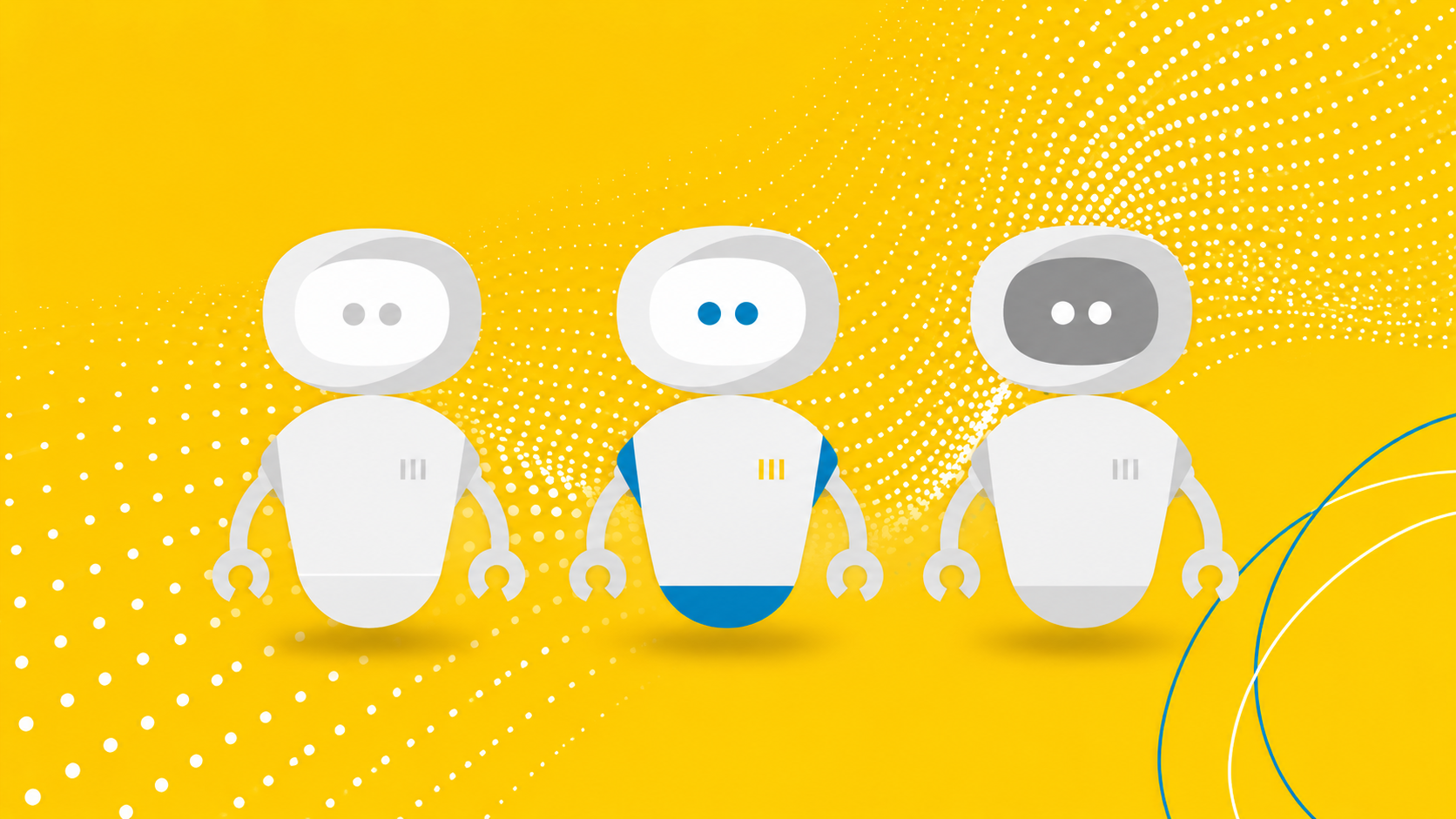
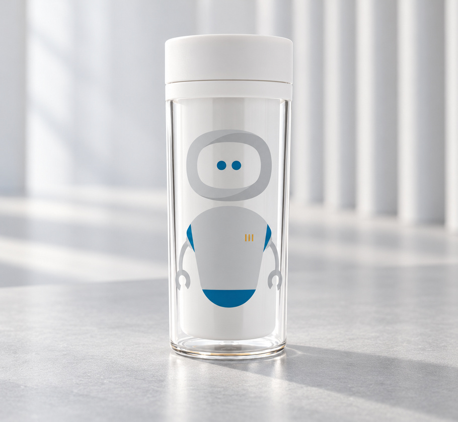
There were parts of the existing brand worth keeping. We retained the colors people already associated with Kryon, removed “Systems” from the name to make it less technocratic and more approachable, and evolved the logo. Oh, and we designed a new character.
Making the new story visible
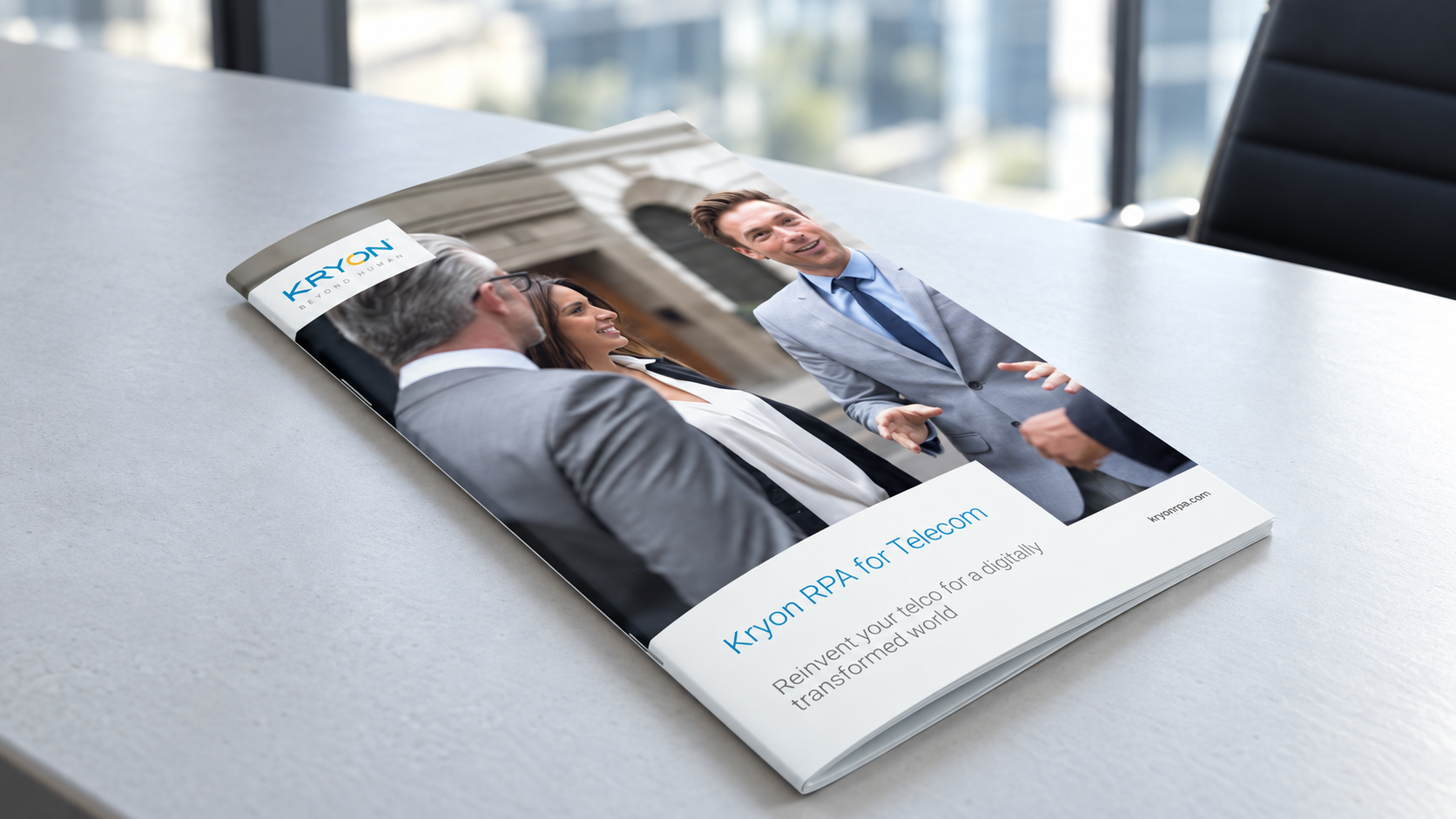
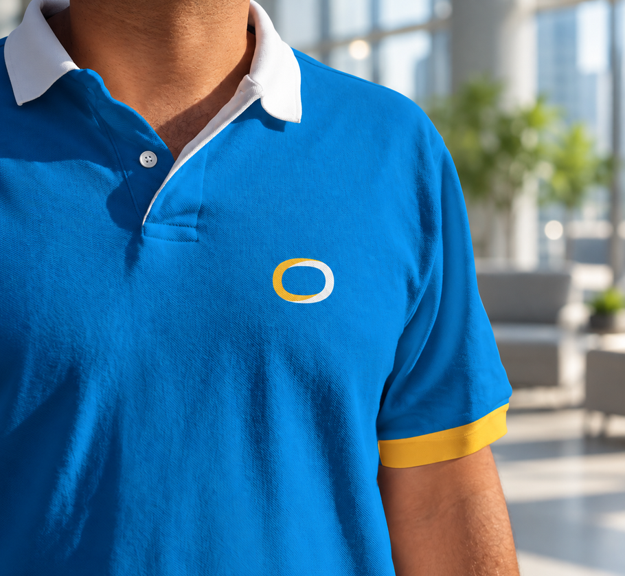
The new identity extended into practically every deliverable you can imagine. These were the materials the team would use to introduce the business every day. They needed to feel like the same Kryon people would meet on the new website.
More than forty pages of follow-through
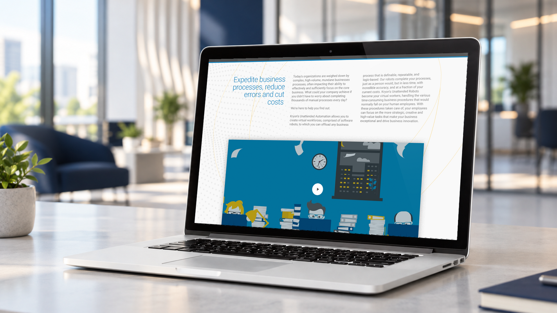
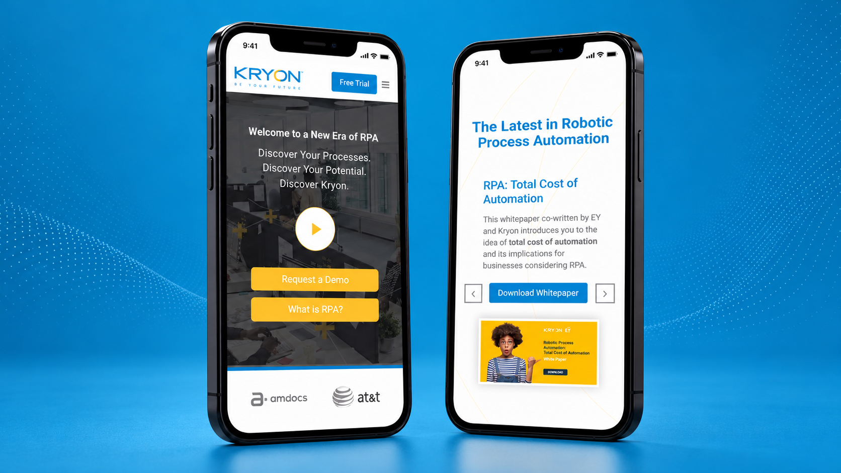
The website ran to more than 40 pages. We started with information architecture, then delivered copy in the new voice, before we designed and developed the responsive WordPress site. The updated identity, photography and robot character all had a part to play. A person arriving on any page needed to meet the same Kryon.
A 20-page brandbook documented the wider identity for the people using it next. For a company helping people move on from repetitive work, there was value in not having to rethink the brand every time they made a presentation.
A 20-page brandbook documented the wider identity for the people using it next. For a company helping people move on from repetitive work, there was value in not having to rethink the brand every time they made a presentation.