Three words with plenty of possibility
Clariter had quite a crowd to talk to: petrochemical companies, industrial waste handlers, policymakers, NGOs, investors and, of course, the rest of us. They weren’t all listening for the same thing. We gave each audience a different way into the story, with one clear position behind it all. Once we’d worked that out, three words said it best: A clean slate.
Clean lines. How appropriate.
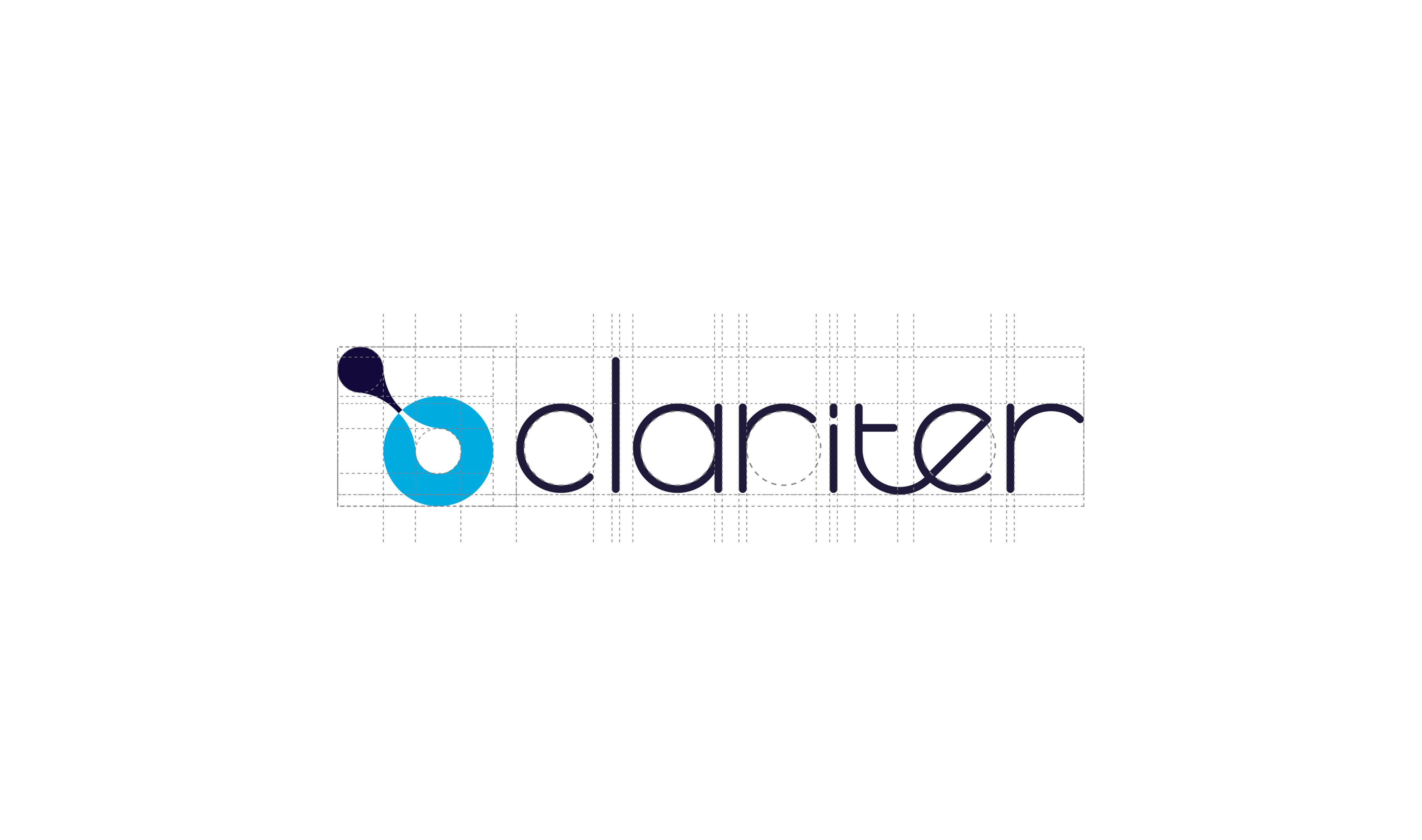
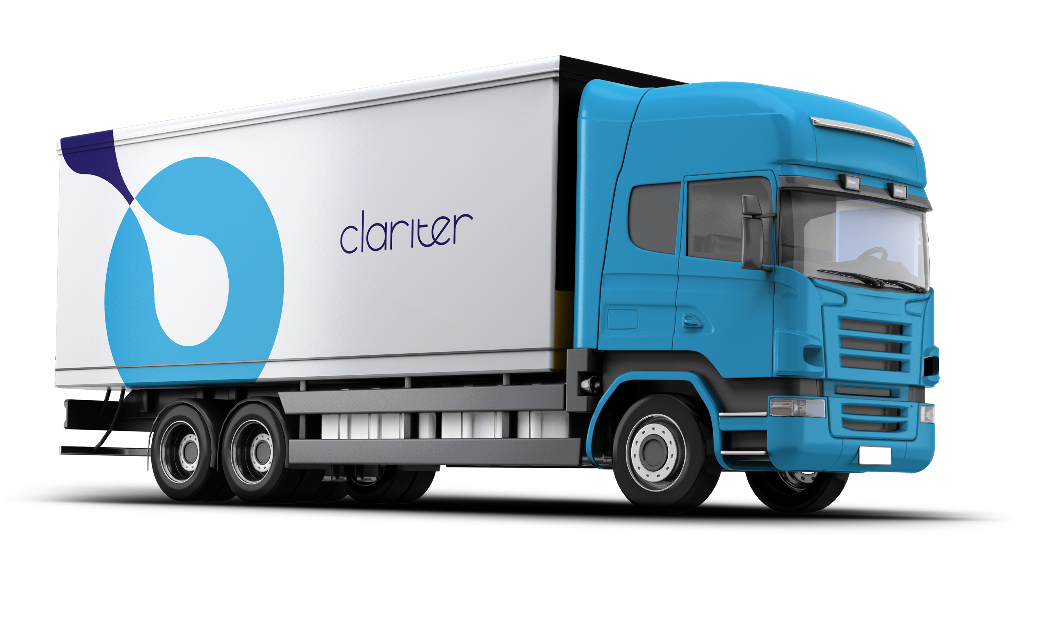
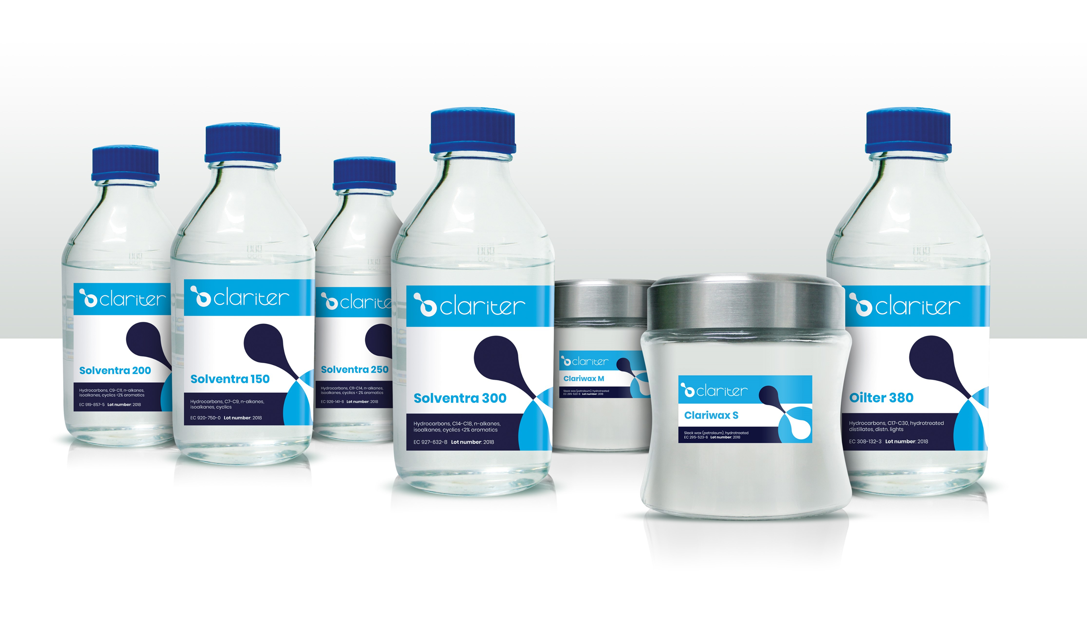
We designed a completely new logo and visual identity that embody the ideas of cleanness and transformation. Cool blues and bright white combined with a lowercase modern font that captures both their professionalism and their humanity and presents Clariter as a serious player in the industrial materials world.
Anything's possible
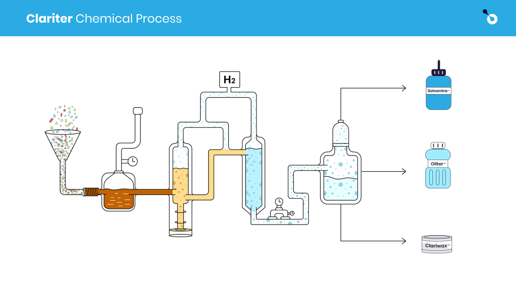
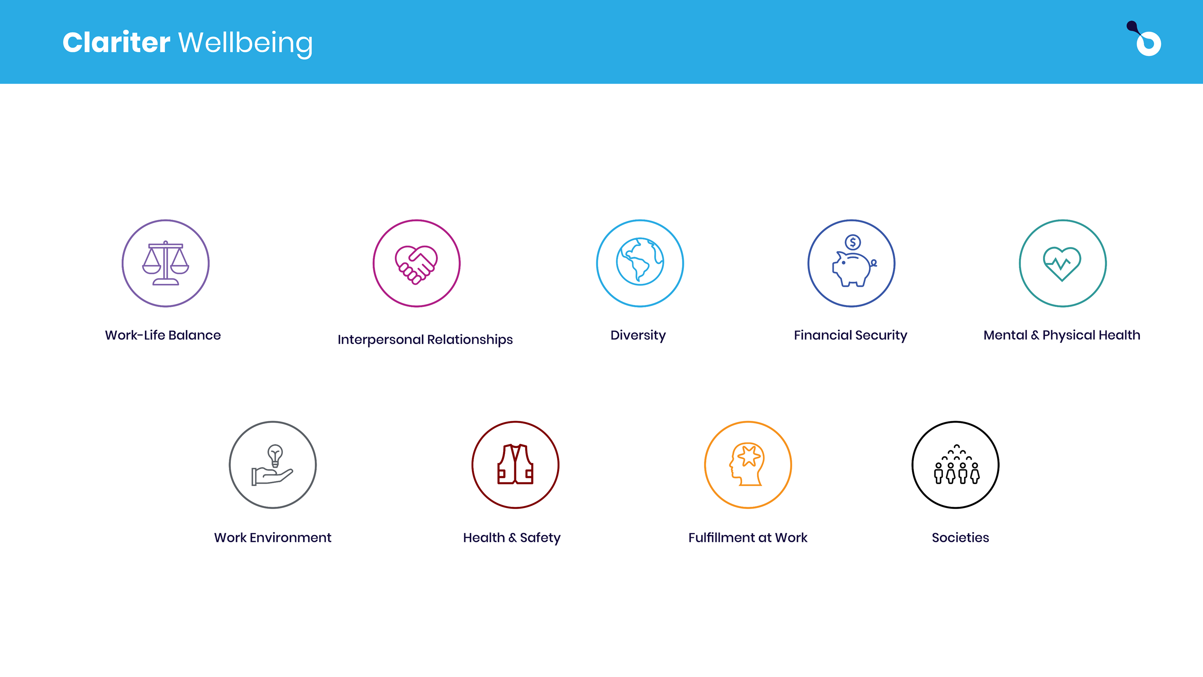
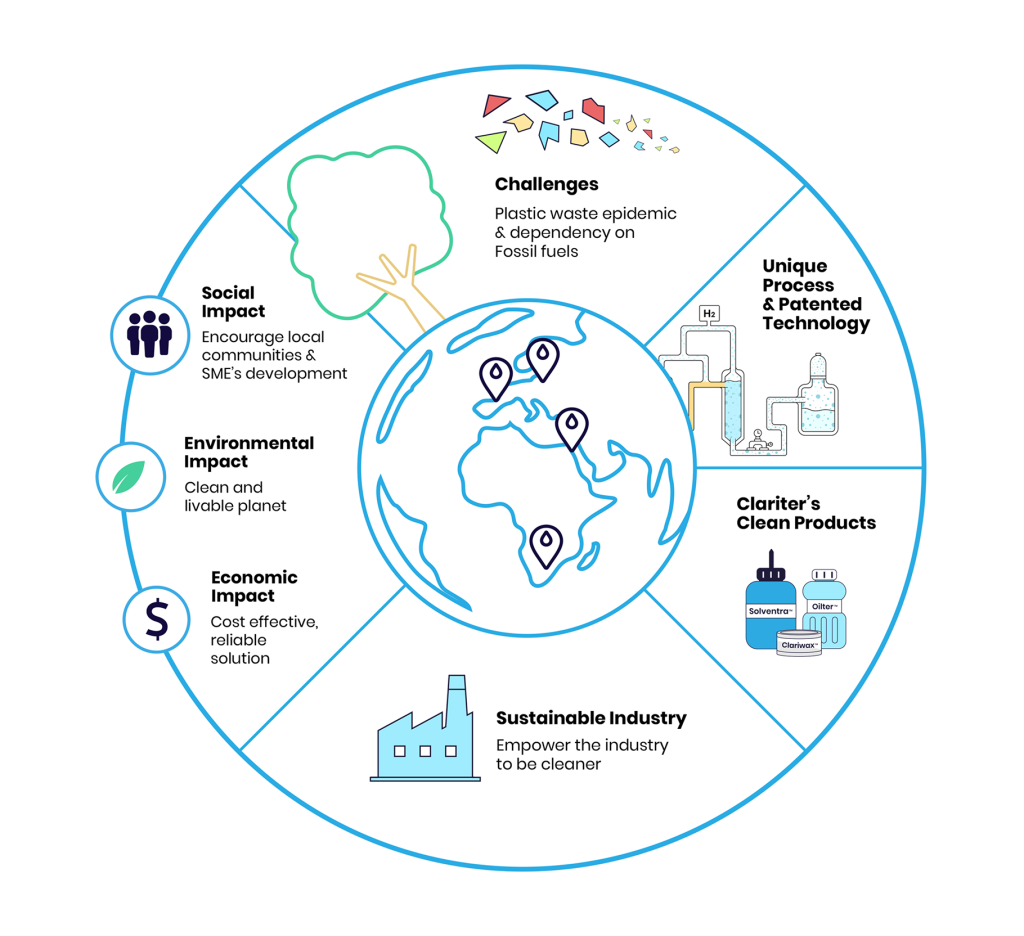
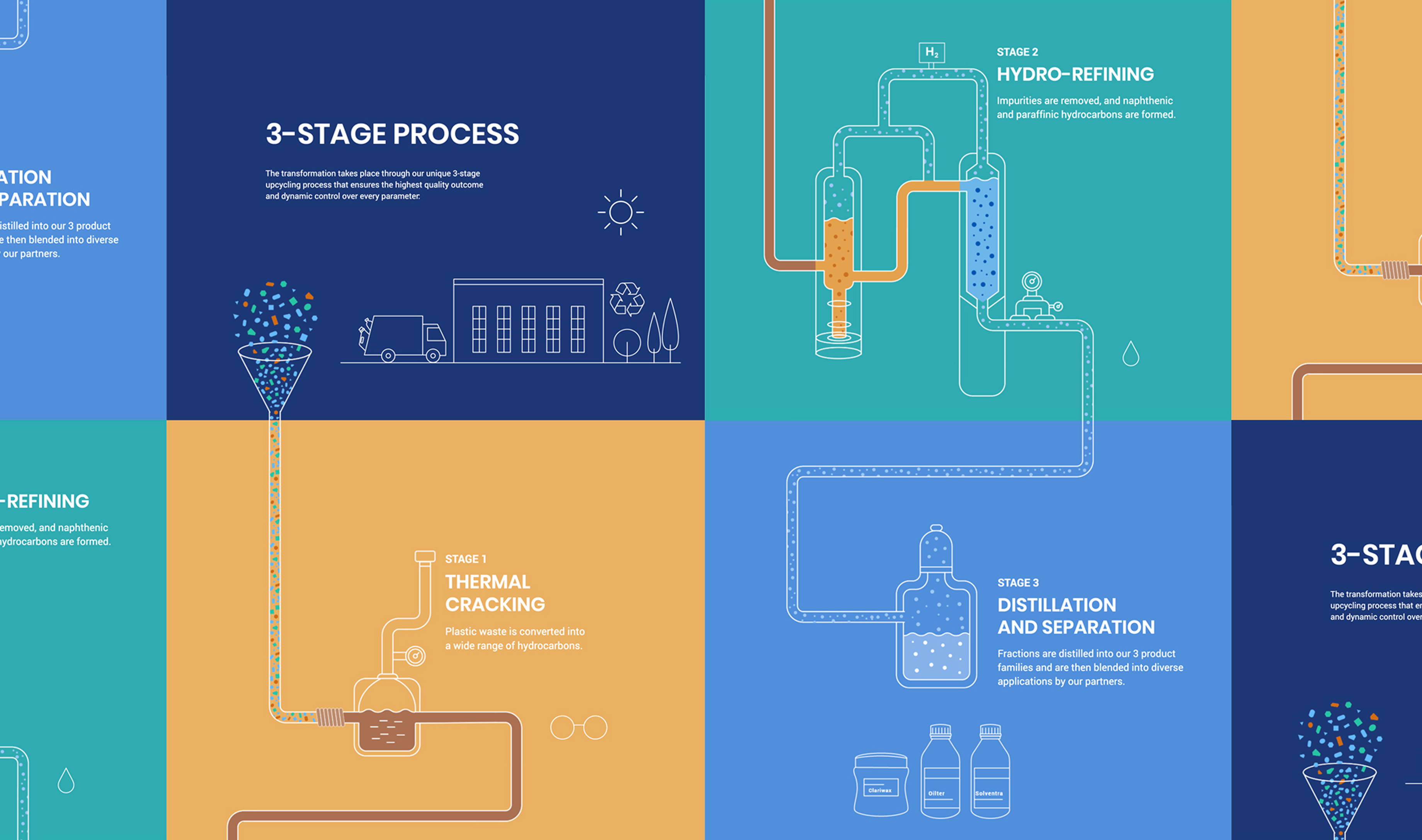
We extended the identity into stationery, presentation templates and a flexible illustration style. That gave Clariter a way to explain its technical work through icons, process diagrams and infographics, all in the same visual language. From the tagline to a technical diagram, each part needed to help people understand the same business.
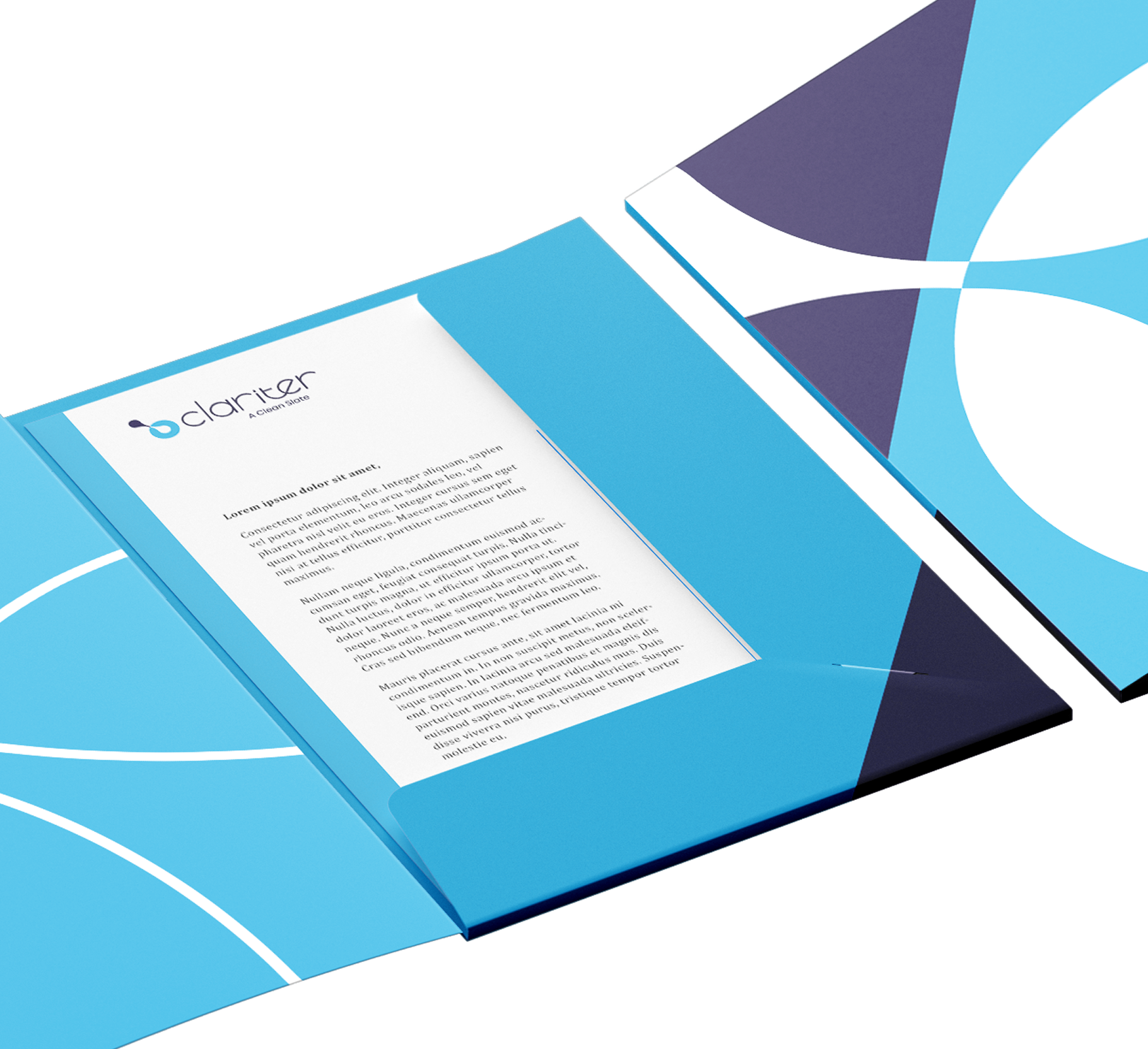
We gave Clariter a clear way to tell a true and groundbreaking, yet complex, story to people with very different priorities. Each audience had a way in, and the brand had a central idea to build on: A clean slate. Three words that made room for everything Clariter had to explain, while giving people something simple to remember. And a beautiful brand to behold.