Their visual brand needed a hook
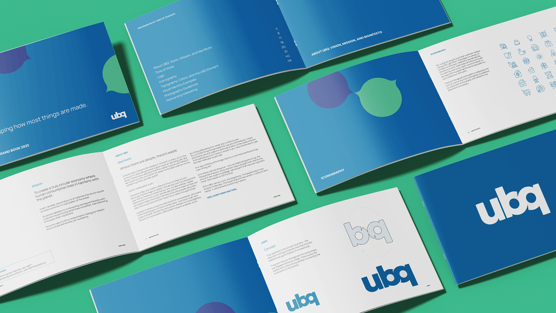
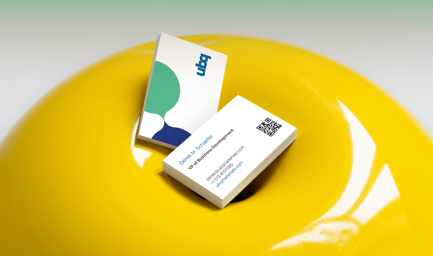
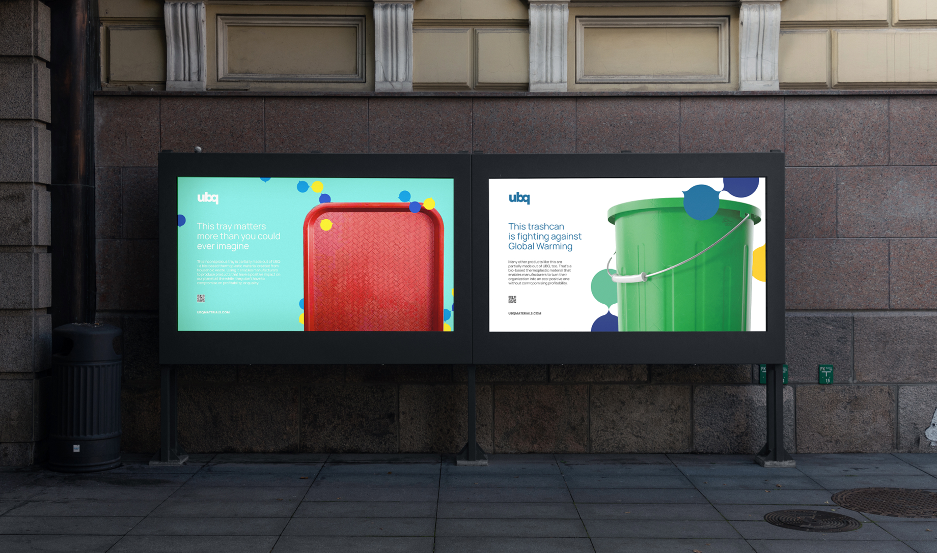
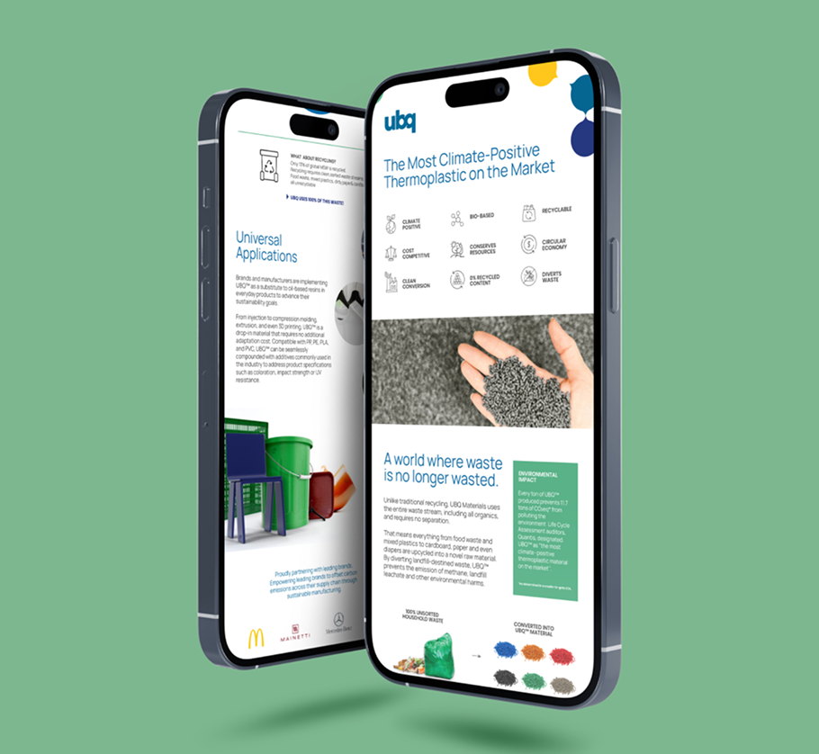
We delivered the UBQ brand back in 2016. Though their story hasn’t changed since we crafted it, the visual aspect of their brand was ripe for a refresh in the wake of all their success — a logo tweak, more white space across the board, brighter colors, those sorts of things. We also wanted to come up with some kind of visual hook that we could build their updated identity around.
Building out the brand
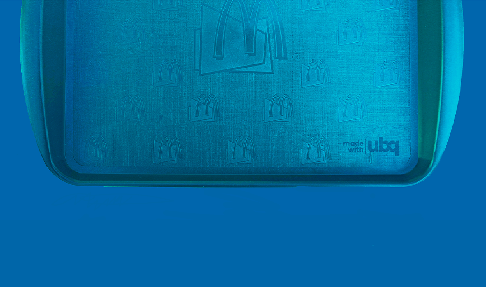
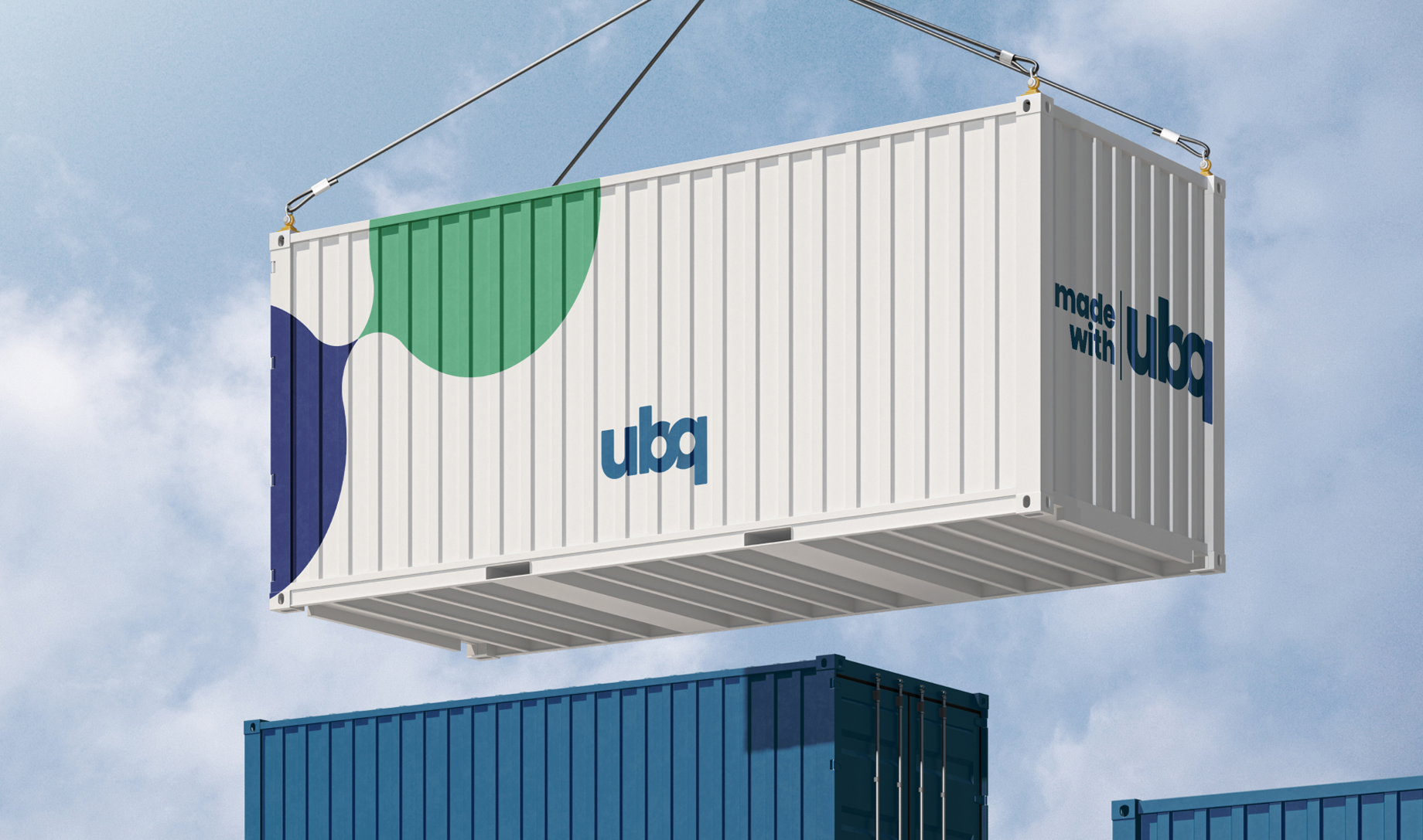
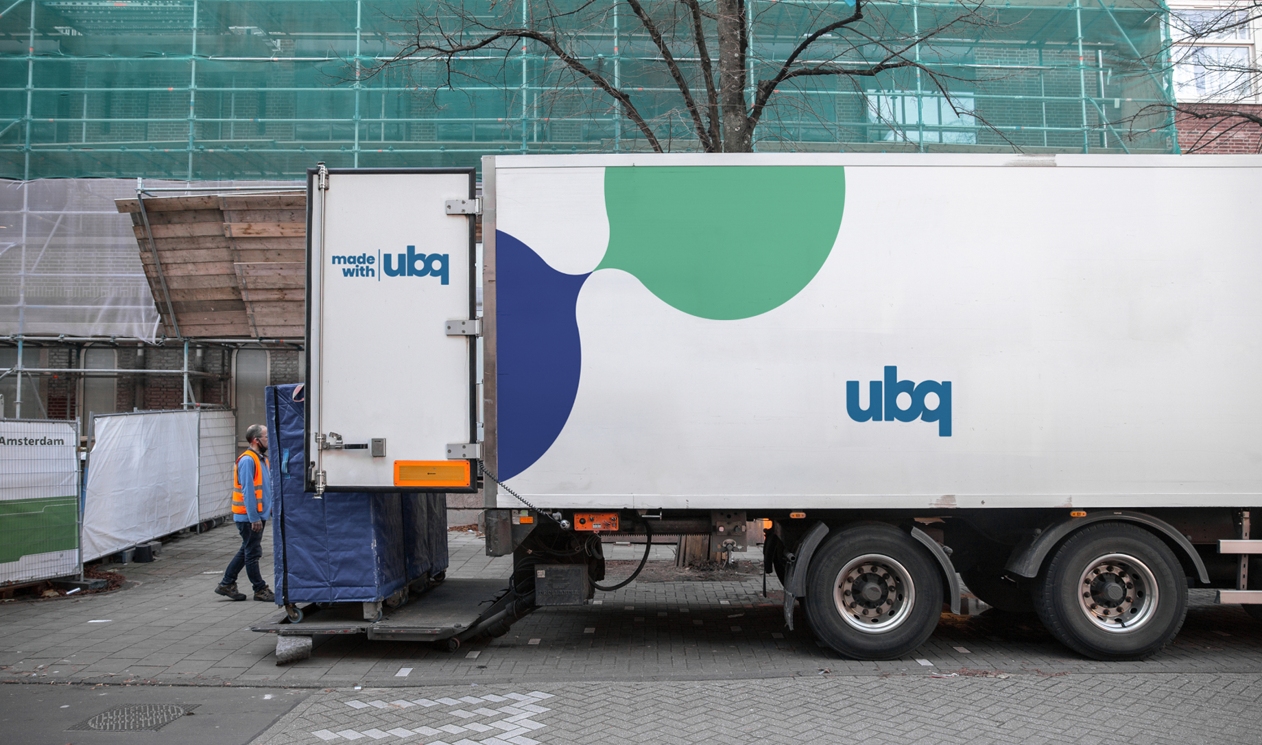
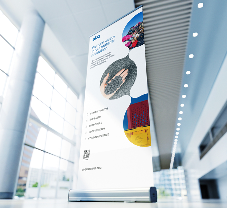
Our proposed graphic element was elegantly simple: the structure of a molecule. We built a completely new visual identity around it, from corporate marketing deliverables to ads, social media templates, a new site design, and revamped brand book that included partnership marketing guidelines.
Forward thinking
The original UBQ story remained. The refresh gave the team a new visual system to carry it, from a single social post to a piece of partnership marketing. A company built around transforming materials had a renewed way to show what made it different.