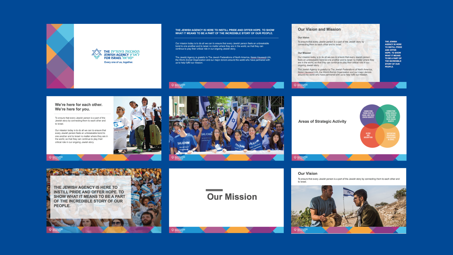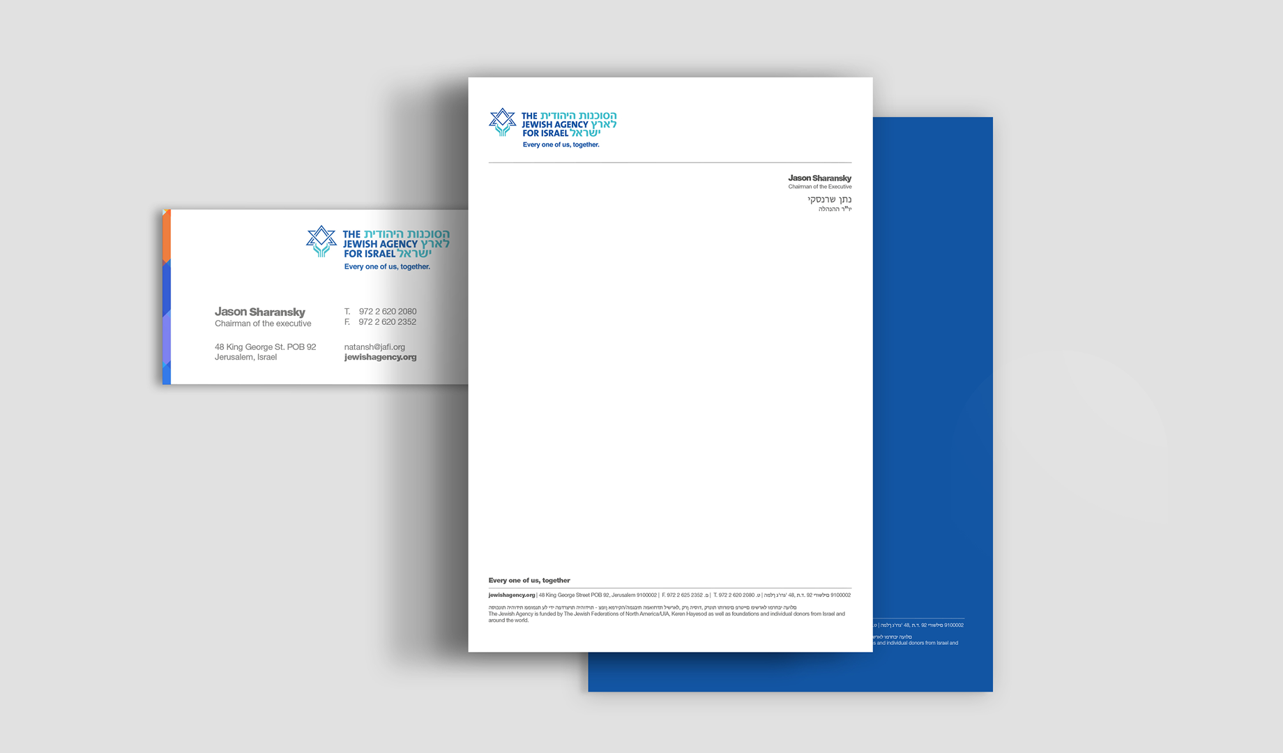
The first step: Excavating.
When they approached us for help with their brand, we were excited to dig in. And we do mean dig: our process included more than thirty interviews and meetings with team members and leaders over six months.
The story we gradually unearthed was about an organization devoted to keeping Jews united. The manifesto culminated in a new tagline that summed this up: Every one of us, together.
The story we gradually unearthed was about an organization devoted to keeping Jews united. The manifesto culminated in a new tagline that summed this up: Every one of us, together.
A vibrant visual identity for a vibrant people.
Then we turned our attention to a new visual identity that incorporates vibrant colors for a vibrant and colorful people. Our design uses a weaving motif to convey the idea that individual threads join together to make a strong, beautiful fabric.
In the Jewish Agency’s new visual identity, each Jew is part of a beautiful tapestry of identity and history…every one of us, together.
In the Jewish Agency’s new visual identity, each Jew is part of a beautiful tapestry of identity and history…every one of us, together.
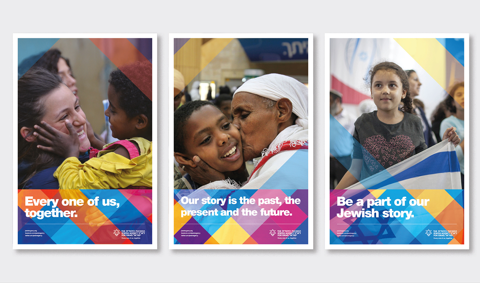
Decades of human stories
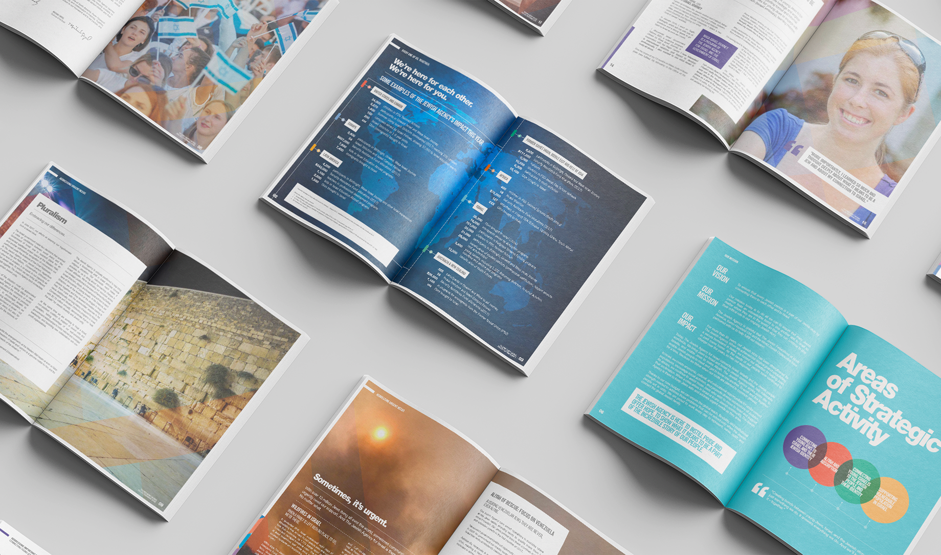
The Jewish Agency’s photo archive held decades of human stories. We helped bring the people in them front and center, showing how a tighter crop or a different framing could draw you closer to a face, an expression, a moment between people.
We also showed the team how to get more from photographs taken in difficult conditions. The emotion was already there. Our job was to help people see it, feel it and connect with the lives behind the work.
We also showed the team how to get more from photographs taken in difficult conditions. The emotion was already there. Our job was to help people see it, feel it and connect with the lives behind the work.
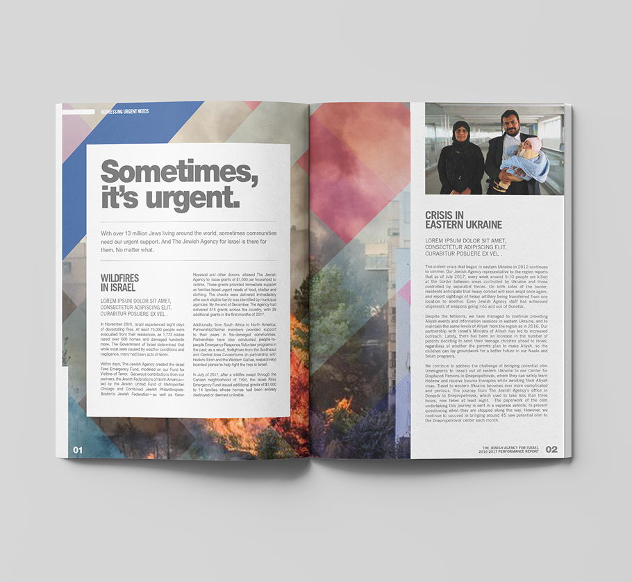
Speaking with a new voice
After leveraging their vast photo library for the right imagery, we had to think about words: the Jewish Agency needed a new way to talk with people. It needed to be human. Clear. Inclusive. So we wrote dozens of headlines and subheads for a wide variety of marketing materials that spoke about beliefs and values in this new voice.
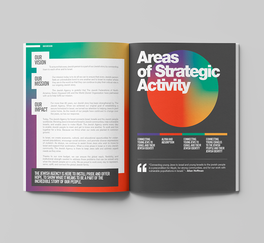
Writing down the commandments
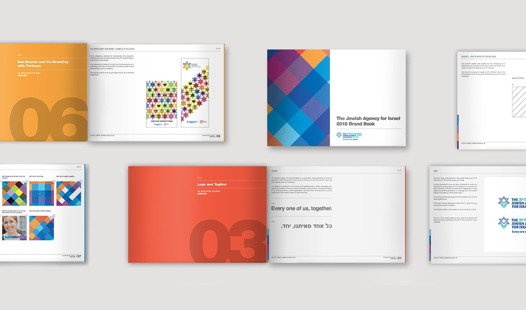
Everything came together in a 70-page brand book, documenting how the new brand should look, sound and work. It gave the people using it a shared reference, wherever they were and whatever they were making. We were proud of the organization, and proud of what we created together. It really did take every one of us.