- Services
- Start Ups
- Technology
Otoma. BRAND STRATEGY, COPYWRITING, LOGO, VISUAL IDENTITY + WEBSITE.
Software testing. Disruptive…cumbersome…and absolutely essential.
In banking, risk has to be avoided. A small error in data processing between different platforms can critically damage banks’ reputations and bottom line. So the software every bank relies on has to be rigorously tested. But with the fintech industry constantly changing, testing has a hard time keeping up and that means banks are bogged down and frequently unable to take advantage of business opportunities.
An early-stage startup, insightGuard (as they used to be called) develops software that uses AI to automate the highest caliber of testing whilst running in the background. insightGuard was poised to revolutionize the financial industry, but their brand didn’t tell their story, feel forward-thinking, innovative, or particularly modern. Well, it’s a good thing we met.

Developing a brand strategy for them required getting up to speed on some complex stuff – fast. As soon as we had even a rudimentary understanding of what they do, we fast realized they were going to fundamentally change the world of enterprise software. No longer would software implementations and upgrades squander time, money, and human potential.
By accelerating and automating these processes, this platform gives people the freedom to pursue new opportunities. That simple fact became the basis for their brand manifesto and culminated in a couldn’t-be-more-true tagline: Welcome to a freer world.


Via the brand strategy process, we were able to understand their drive of bringing the power of automation to the financial industry. But their name didn’t reflect them. So we began a naming process and came up with dozens (yes, dozens) of name options. We narrowed them down to one that fit the bill: Otoma. Why? Here’s a hint. Just think A-U-T-O-M-A-T-I-C.

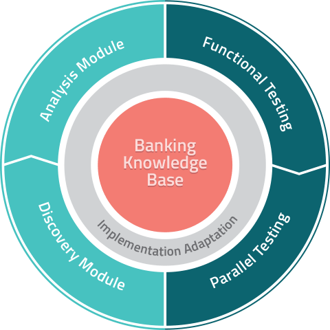
Turning an intangible-like software into something visual is a challenge, but we leveraged a circular shape to represent the testing cycle. With a minimalist modern font for their name and a distinctive palette of soothing colors, their new brand came to life as distinctively and unique as their offering. We applied the new identity to marketing materials and stationary. Diagrams of their product suite and the technology’s process flow were on the list, too.


That work got us past the “look and feel” phase, but we still needed to describe what Otoma does in copy for their website. So we dove deeper into their products to provide them with language that captured their role as innovators in an extremely complex, dynamic, and high-stakes industry.

Otoma’s website had to do three things: attract talent, introduce their products, and create interest from prospective clients. We delivered UX that included what they needed now but that could accommodate future requirements, too – this was one client that had to be ready for rapid growth. We then designed the entire site and extended Otoma’s core brand language and graphic elements in the process.

Otoma is more than ready to take their industry by storm. Using everything we learned in our strategy and marketing materials immersions, we focused on bringing their brand voice to life as we communicated one clear message across many deliverables: The word of testing is changing, and Otoma is the company that’s taking it to the next level.
