- Advertising
- Art
- Branding
- Communication
- Creativity
- culture
- Design
- Digital
- Ecommerce
- Education
- Employees
- Exercise
- Film
- Founders
- Intern
- Marketing
- Medical
- Memory
- Music
- Networking
- Personal
- Personal Branding
- Privacy
- Public Relations
- Rebranding
- Self
- Social Media
- Society
- Speaking
- Sport
- Sustainability
- Technology
- Testing
- Tips
- Travel
- Women
- Writing

A few months back we gave the natie brand an overhaul with a new logo and website. We also revamped our business cards and made each and every one decidedly unique. Not just in the way that each team member got their own personal lines, or in the design of the cards themselves – but in how the cards were actually created. Which, to me, is interesting enough to write about.
Let’s go back to our logo which employs an overlap in its design – meaning, the letters of each word overlap transparently over each other. The overlap conveys that although we’re all separate entities, together we are one. From creative to production, from designer to writer, from animator to sound, from project and account management to web development, we’re a team that gels together. We’re also a colorful bunch, hence the fun colors. I wanted to get all of this across and did with the help of our amazing designer.
Once the design was complete, it was pretty easy to get it across in the digital realm. Not so for print. To get it across beautifully in print is trickier. And while today some say digital is all you need, well, I like business cards. There’s something about a well-crafted leave-behind for people to remember you by that can’t be replaced. Not everyone can pull this off well in print, and getting quality results requires care and know-how. So, we hit up our talented friends at mama’s sauce in florida and worked with them hand-in-hand (albeit remotely) to bring our vision to life.
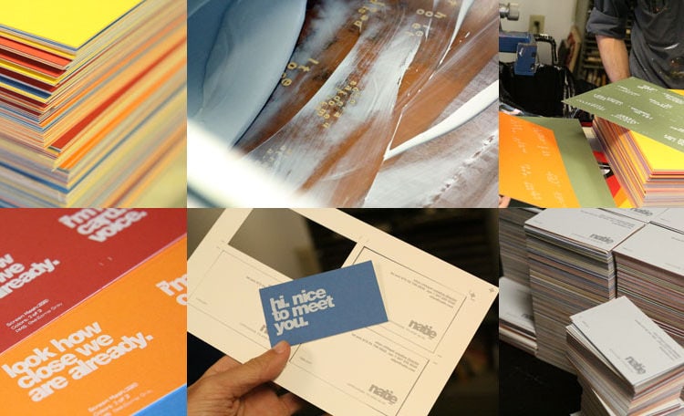
After countless discussions and deliberations we decided on a way forward. Mama’s sauce employed an old printing technique — screen pressing. This process dates back to china circa 960 bce. Yeah it’s been around for a while but was finally made universally popular in the 60s by andy warhol when he depicted marilyn monroe in various colors. It’s a technique that uses woven mesh to support a stencil that then applies ink onto material – whether it be on paper or fabric. The results are beautiful. I could go on about it forever but to read more about this detailed, intensive and awesome process, just read about it here.
We chose a very heavy stock for our cards as I wanted something substantial for people to keep. What’s funny is that mama’s sauce happened to have some paper samples in their workshop that perfectly matched our brand colors so we didn’t have to special order paper. And there’s nothing quite like using color stock instead of applying ink to get the color you want. In their words, ‘there’s a real sense of authenticity that is just plain impressive when you see a card with a colored background and it’s the paper, not the ink, that gives the color’.
A lot of precision, time, care and love was given to each and every one. You can see from the pictures that creating the natie business cards was an intricate process. And we love intricate. I personally love our cards and still find myself looking at them and marvelling at what a great job mama’s sauce did, along with my team for bringing the natie brand to the next level. Here’s hoping we get to meet you soon and hand you one in person.


